With a paper chart spread across the nav table, the eternal question was “Where am I?” With a glowing plotter screen showing your position to the metre, you’d think we’d have it sorted. Instead, we’ve traded one mystery for another: “Where is all this going?”
The paper chart era had a beautiful simplicity. You bought a chart, it got outdated, you bought another one. The Admiralty or SHOM or whoever drew the coastlines, you trusted them, end of story. Sure, you might spend twenty minutes with parallel rulers trying to figure out if that smudge was your position or last night’s coffee—but at least you understood the system.
I still have a stack of those 1×1.5 metre Pacific charts in fathoms, sleeping under my bunk. Everyone says they’re the most trustworthy charts ever made—probably because those who disagreed aren’t around to tell us otherwise.
Digital charts have given us something miraculous: a little boat icon that actually shows where we are, in real time, while we sip coffee in the cockpit. But behind that friendly icon lurks a bewildering world of competing standards, international organizations, government agencies, commercial providers, encryption schemes, licensing models, and subscription fees. The navigation problem is solved. Understanding the chart itself? That’s the new puzzle.
The Three Kingdoms of Digital Charts
Digital nautical charts come from three distinct worlds, each with its own philosophy, pricing, and quirks:
Official Charts (ENCs) are produced by national hydrographic offices—government agencies responsible for surveying their waters and publishing authoritative chart data. These are the “legal” charts, the ones that satisfy SOLAS requirements for commercial vessels. They’re created by organisations like NOAA (USA), UKHO (UK), SHOM (France), BSH (Germany), and about 90 others worldwide.
Commercial Charts come from companies like Navionics (now Garmin), C-MAP (now Navico), Garmin BlueChart, and Jeppesen. These providers take official data, repackage it, enhance it with additional features, and sell it through their own ecosystems. They often add proprietary bathymetry, points of interest, aerial photos, and—crucially—crowd-sourced updates.
Open Source Charts include projects like OpenSeaMap (the maritime equivalent of OpenStreetMap), OpenCPN (an open-source chart plotter), and various community-driven initiatives. These are free, collaborative, and improving steadily—though coverage and accuracy vary wildly by region.
The Uncomfortable Truth
There is no “best” chart in the world. Not for quality, not for price, not for coverage. The chart that’s perfect for the Chesapeake might be useless in the Aegean. The one that’s free in Florida costs a fortune in the French Riviera. Every sailor eventually discovers this the hard way.
The IHO: Herding Hydrographic Cats
At the centre of this chaos sits the International Hydrographic Organization (IHO), based in Monaco—appropriately enough, a place where even parking spots cost more than most sailors’ annual chart budget.
The IHO doesn’t make charts. Instead, it creates the standards that allow charts from different countries to work together. Think of it as the UN of nautical cartography: lots of meetings, careful diplomacy, and the process of building international consensus among member states.
Each member country operates its own hydrographic office, surveys its own waters (mostly), and produces charts according to IHO standards. The quality, completeness, and update frequency vary enormously. Some countries survey their coastlines with modern multibeam sonar every few years. Others are still working from lead-line soundings taken during colonial times.
The Economics: Free, Expensive, and Ridiculous
Here’s where it gets interesting. In the United States, NOAA provides all official electronic navigational charts completely free. Download them, use them, update them—no charge. This is because NOAA is taxpayer-funded and operates under the principle that data collected with public money should be available to the public.
Yes, for once, Americans don’t pay for a service. Let that sink in.
Cross the Atlantic, and the picture changes dramatically. The UK Hydrographic Office charges for its AVCS (Admiralty Vector Chart Service) charts. French SHOM charts require payment. Australian charts aren’t cheap. Some regions charge hundreds of euros for annual coverage that wouldn’t cover a decent weekend cruise.
Why the difference? Philosophy and funding models. Some hydrographic offices are expected to be self-funding, recovering survey costs through chart sales. Others receive full government funding and give data away. There’s no global consistency—just a patchwork of national policies that make planning a Mediterranean cruise feel like navigating tax jurisdictions.
Each hydrographic office licenses its own regional data, reflecting the cost of maintaining national survey programs. Cruising across multiple jurisdictions means purchasing coverage from each relevant charting authority.
The Price Gap
A sailor cruising from Miami to the Bahamas can use free NOAA charts for the US portion and relatively affordable charts for Bahamian waters. A sailor cruising from Gibraltar to Greece might spend €300-500 annually on official chart coverage—for essentially the same amount of sailing. Same ocean, vastly different economics.
S-57: The Standard That Runs (Most of) the World
Nearly every digital chart you’ve ever used is based on a standard called S-57, officially “IHO Transfer Standard for Digital Hydrographic Data.” Introduced in the 1990s, S-57 defines how chart data is structured, encoded, and exchanged.
S-57 uses a sophisticated object-oriented data model. It uses an object-oriented model where everything on a chart—coastlines, depth contours, buoys, wrecks, traffic separation schemes—is defined as a “feature” with “attributes.” A buoy isn’t just a symbol; it’s an object with properties: position, colour, light characteristics, radar reflector status, and dozens of other possible attributes.
This structure allows chart plotters to do intelligent things: filter by depth, highlight dangers, query objects for information. But it also means the data format is nothing like a simple image. It’s more like a specialised database, and reading it requires software that understands the schema.
S-100: The Future Is Coming (Slowly)
S-57 served well for decades, but the maritime world has outgrown it. Enter S-100, the next-generation framework that’s gradually replacing S-57. (S-100 development began in 2010 and involves coordination across 90+ member states, with full implementation expected between 2026-2030.)
S-100 isn’t just a chart standard—it’s a framework for multiple types of maritime data. Under its umbrella:
- S-101: Electronic Navigational Charts (the direct successor to S-57 ENCs)
- S-102: High-resolution bathymetric data
- S-104: Water level information (tides, currents)
- S-111: Surface currents
- S-124: Navigational warnings
- S-129: Under keel clearance management
The promise is powerful: a unified framework where your plotter can seamlessly integrate chart data, real-time tidal information, current predictions, and official navigational warnings. The reality is a multi-year transition that’s still unfolding, with different countries and manufacturers adopting S-100 products at different speeds.
S-63: The Encryption Layer You Never Asked For
Here’s where things get properly bureaucratic. Official ENCs are protected by a security scheme called S-63, which uses encryption to control distribution and prevent piracy.
The system works like this: hydrographic offices encrypt their chart data. To decrypt and use it, you need a permit—essentially a licence key tied to your specific chart plotter or software. These permits are issued through a chain that runs from the hydrographic office through data servers and Value Added Resellers (VARs) to your device.
The critical point: this licensing and encryption architecture isn’t chosen by Navionics or Garmin or whoever sells you the charts. It’s imposed by the IHO and national hydrographic offices. The retailer is just a conduit. When you’re frustrated that your chart subscription seems complicated or that transferring charts between devices is painful—blame the standards bodies, not the shop.
The Crowd to the Rescue
Official charts have a fundamental limitation: hydrographic offices can’t survey everywhere. They prioritise commercial shipping lanes, major ports, and areas of strategic importance. That quiet anchorage you love? That shallow bay perfect for a lunch stop? Unless there’s significant traffic, it might not see a survey vessel for decades.
This is where crowd-sourced data becomes transformative.
Navionics pioneered this approach with their SonarChart and Community Edits features. Millions of recreational boaters, each with a depth sounder and GPS, collectively generate bathymetric data as they sail. This data is aggregated, processed, and used to enhance official charts—filling in the gaps that governments can’t or won’t survey.
It’s the same principle that makes Google Maps traffic data so accurate: millions of phones silently reporting their speed, aggregated into real-time traffic patterns. Navionics (and C-MAP with their Genesis feature) apply this to depth soundings.
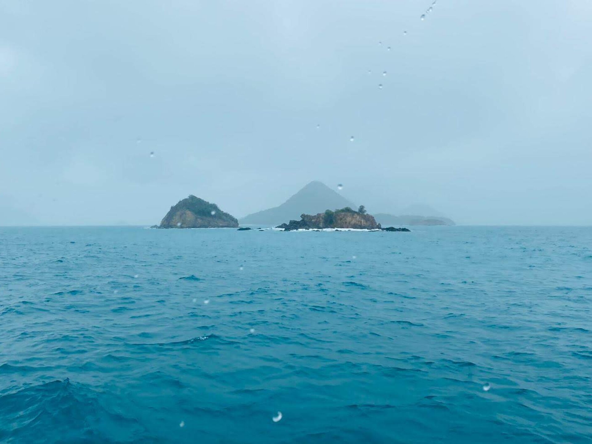
The Folegandros Lesson
I once spent half an hour searching for a quiet bay on the east coast of Folegandros, a small island in the Greek Cyclades. Navionics showed a promising indent in the coastline, but the depth data was vague—no detailed soundings, just approximations. Strange, I thought, for such an attractive-looking spot.
Approaching carefully, the reason became clear: the cliffs above were unstable, with obvious signs of rockfall. Not a place you’d want to anchor. The lack of detailed crowd-sourced data wasn’t a failure—it was information. No detailed soundings meant no boats had lingered there. The crowd, by its absence, was telling me something the official chart couldn’t.
(If you can now anchor there safely—but dangerously—because the depths are finally charted, you’re welcome.)
OpenSeaMap and the Open Source Alternative
Not everyone wants to pay subscriptions or feed data to commercial providers. OpenSeaMap takes a different approach: community-driven, open-source, and free.
Built on OpenStreetMap infrastructure, OpenSeaMap relies on volunteers to contribute data—depth soundings, harbour information, navigational aids, and more. It can be used with various chart plotters and navigation apps—it’s not tied to any particular software.
The coverage is uneven. Popular sailing areas in Northern Europe have excellent OpenSeaMap data. Remote regions may have little. But the trajectory is encouraging, and for sailors philosophically opposed to subscription models or data harvesting, it’s a viable alternative—especially when combined with free official ENCs from regions that provide them.
There have been various initiatives to create open crowd-sourced depth databases—sailors logging their soundings for the common good. Noble idea, classic catch-22: without many users contributing, the data is sparse; without good data, users don’t bother contributing. Commercial providers like Navionics solved this by bundling data collection invisibly into products people already use. Open alternatives struggle to reach that critical mass.
Living, Breathing Charts
Here’s the fundamental shift in thinking that digital charts demand: a chart is no longer a static product. It’s a living, evolving dataset.
Paper charts were frozen in time from the moment they were printed. You bought them, applied corrections with pen and ruler if you were diligent, and eventually replaced them. The chart on your nav table was months or years out of date by definition.
Digital charts can update continuously. New hazards appear. Incorrect depths get corrected. Crowd-sourced data fills in gaps. Buoys that dragged off station get repositioned. The chart on your plotter this morning might be measurably better than the one last month.
This continuous improvement is what justifies subscription models—if they’re reasonably priced. You’re not just buying data; you’re buying ongoing curation, integration of new surveys, processing of crowd-sourced contributions, and the infrastructure that delivers updates to your device.
The key word is “reasonable.” Some chart subscriptions offer genuine value—frequent updates, good coverage, responsive crowd-sourcing integration. Others feel like rent-seeking, charging premium prices for data that barely changes. As with everything in the marine industry, caveat emptor.
So Where Are We Going?
The world of digital charts is messy, complicated, and often frustrating. Standards overlap. Pricing is inconsistent. Data protection follows the S-63 standard. The “best” chart depends entirely on where you’re sailing, what you can afford, and how much you trust the crowd versus the government surveyors.
But it’s also getting better. S-100 promises richer, more integrated data. Crowd-sourcing fills gaps that official surveys never will. Open-source alternatives provide options for those who want them. And the fundamental miracle remains: a little icon showing exactly where you are, updated in real time, on a chart that improves while you sail.
We’ve traded the paper chart’s “Where am I?” for a more complex question. But at least now, when we’re lost, we’re lost with much better data.
The chart is no longer a snapshot—it’s a stream. And somewhere in that stream, other sailors are contributing the depths of bays you haven’t discovered yet. Just maybe not the ones under unstable cliffs in Folegandros.


Leave a Reply