You wouldn’t drive across Europe with a 1940s road map. But that’s effectively what you might be doing at sea. Half of the depth information on NOAA charts comes from surveys conducted before 1940. Some areas haven’t been re-surveyed since the Victorian era. The International Hydrographic Organization estimates that obstacle positions in electronic charts can be off by up to 500 metres, and depths can vary by ±7 metres from reality. That’s not a rounding error. That’s the difference between safe passage and a holed hull.
And yet, we casually tap our chartplotter screens and assume they know what’s beneath us.
This is the story of where those charts actually come from, why your phone is quietly uploading your sailing data to a commercial database, and whether the €200 you’re spending on Navionics is buying you safety—or just a comfortable illusion.
The Alphabet Soup: What All These Acronyms Actually Mean
Before we can understand what’s on your screen, we need to decode what’s behind it.
IHO (International Hydrographic Organization): The UN-affiliated body that sets global standards for nautical charts. Think of them as the ISO for the sea.
IMO (International Maritime Organization): Regulates commercial shipping. They’re the ones who decide that a 50,000-ton tanker needs certified charts, while your 40-foot sailboat can navigate by whatever app you downloaded.
S-57: The current international standard for Electronic Navigational Charts (ENCs), adopted in 1992. Every official digital chart in the world follows this format.
S-100/S-101: The next generation of standards, rolling out between 2026 and 2030. Promises higher resolution, dynamic data layers (tides, currents, under-keel clearance), and integration of multiple data sources.
ECDIS (Electronic Chart Display and Information System): The certified navigation computer required on commercial vessels over 500 gross tons. Costs tens of thousands of euros, requires type-approval, and must display charts exactly according to IHO specifications.
ENC (Electronic Navigational Chart): Vector charts produced by official hydrographic offices that meet S-57 standards. The only charts that satisfy SOLAS (Safety of Life at Sea) requirements for commercial shipping.
Your Navionics app? It’s none of these. It’s a consumer product that happens to display nautical data. The distinction matters more than you might think.
Where Charts Actually Come From: The 150-Year-Old Data Problem
Every nautical chart—whether on paper, your chartplotter, or your phone—traces its lineage back to a hydrographic office. These are government agencies tasked with surveying their nation’s waters:
- NOAA (USA): The National Oceanic and Atmospheric Administration
- UKHO (UK): The UK Hydrographic Office, publishers of Admiralty charts
- SHOM (France): Service Hydrographique et Océanographique de la Marine
- IIM (Italy): Istituto Idrografico della Marina
- BSH (Germany): Bundesamt für Seeschifffahrt und Hydrographie
These offices conduct surveys using multibeam sonar, lidar, and satellite altimetry. They compile the data, verify it, and publish official charts. Commercial providers like Navionics and C-MAP license this data, reformat it for their platforms, and add proprietary layers.
But here’s what the marketing brochures don’t mention: hydrographic surveying requires significant resources, and maintaining global coverage is an ongoing effort. At the start of the Seabed 2030 project in 2017, only 6% of the world’s ocean floor had been surveyed to modern standards. As of 2025, that figure has reached 27%. That means three-quarters of the seabed is essentially unknown.
The Mediterranean is relatively well-charted—France, Italy, and Spain maintain active hydrographic programmes. But even here, you’ll find areas where the last survey was conducted with lead lines and sextants, before your grandfather was born.
Commercial Ships vs. Pleasure Craft: Why Tankers and Sailboats Need Different Data
A 300-metre container ship and a 12-metre sailing yacht share the same waters but have entirely different navigation requirements.
The commercial vessel needs:
- Guaranteed minimum depths along shipping lanes
- Traffic Separation Schemes (TSS) precisely plotted
- Under-keel clearance calculations
- Type-approved ECDIS equipment
- Backup systems and paper chart fallback
- Charts that meet SOLAS legal requirements
The recreational sailor needs:
- High-resolution bathymetry in anchorages and coastal waters
- Detailed harbour approaches
- 1-metre depth contours where the commercial chart shows “5m or less”
- Rocks, reefs, and isolated dangers in the places big ships never go
- Current conditions, not just what was surveyed in 1987
This is the fundamental mismatch. Official ENCs are designed for deep-draught vessels following established routes. Survey resources are allocated based on traffic volume and navigational risk, prioritizing commercial shipping routes.
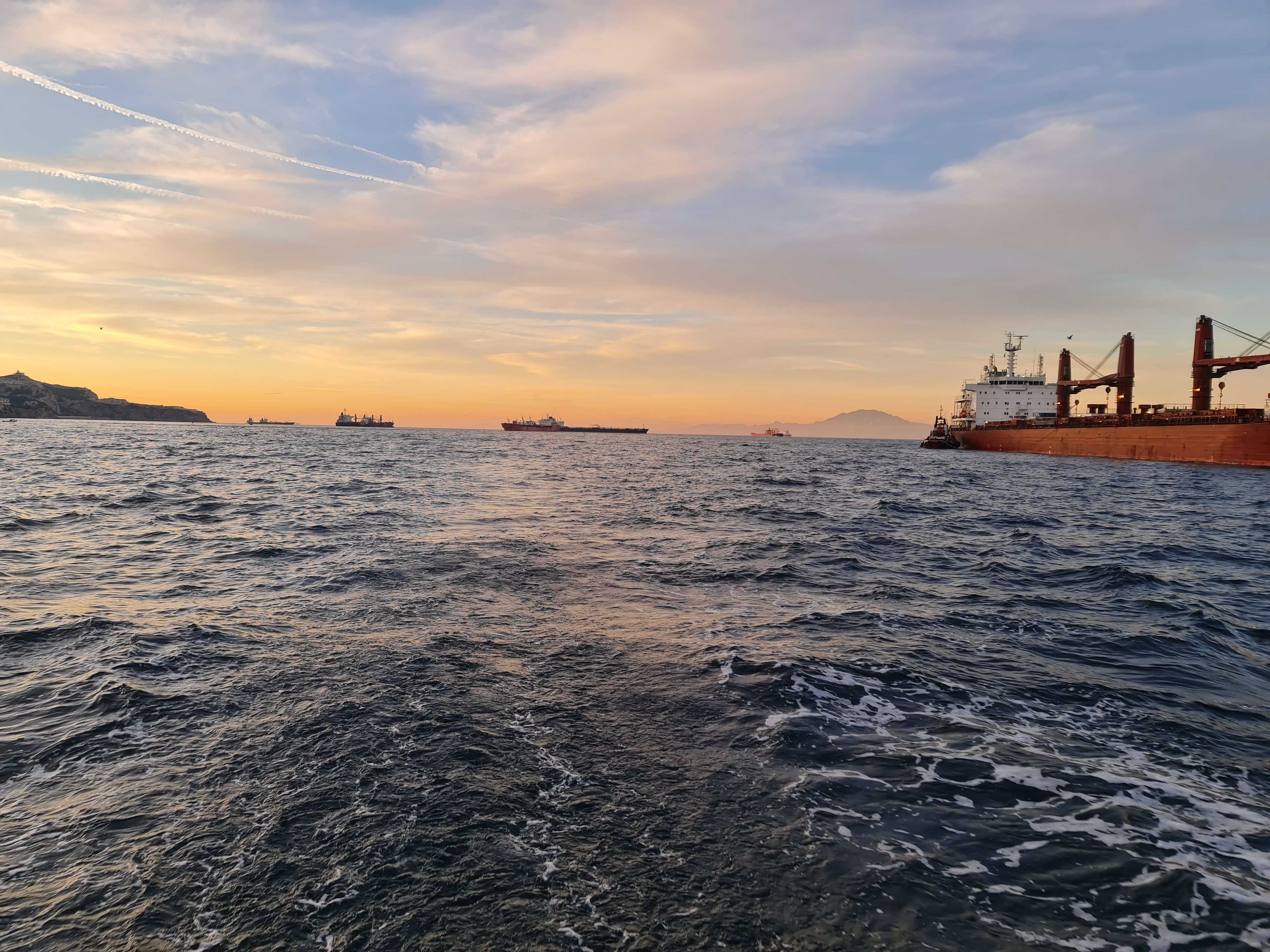
You’ve never seen a VLCC anchored in the bay where you swim. But you’ve passed through Gibraltar, where the same Traffic Separation Schemes apply to supertankers and daysailers alike. The rules are the same. The data requirements are not.
The Crowdsourcing Revolution: How We All Make Charts Better
Here’s something worth appreciating about modern chart technology: every time you sail with Navionics, you’re part of the largest collaborative bathymetry project in history.
Navionics’ SonarChart feature works by aggregating depth data from users’ sounders. The concept is elegant: millions of boats with depth sounders, all collecting real-time bathymetry, all feeding into a constantly-updated chart. Your individual sonar log—a file sitting on an SD card that you’d probably never look at twice—becomes genuinely valuable when combined with millions of others.
This is the magic of aggregation: raw depth readings from a single boat are essentially noise. But process and combine data from thousands of passages over the same area, apply sophisticated algorithms to filter errors, correct for tides, and validate against official sources—and suddenly you have chart data that rivals professional hydrographic surveys.
When you enable SonarChart Live, your depth data “generates a stream of private data shared with Navionics to improve SonarChart for all boaters.” If you use the Chart Installer to update your SD card, the “upload sonar logs” option lets you contribute automatically. Many Simrad and Lowrance plotters record sonar logs by default—ready to share when you’re connected.
According to Garmin’s Terms of Use (Navionics was acquired by Garmin in 2017), users grant the company a license to use contributed data. This is standard practice for any crowdsourced platform—and it’s what makes the whole system work.
The deal is straightforward: You contribute depth data that would otherwise sit unused on your SD card. In return, you get access to processed, validated, constantly-updated bathymetry that no individual sailor could ever create alone. Garmin invests in the infrastructure, algorithms, and quality control that transforms millions of noisy data points into reliable chart information. Everyone benefits—especially in anchorages and coastal areas where official surveys are decades old.
This commercial approach has delivered results that volunteer projects simply can’t match. It’s the same model that made Google Maps indispensable: make contribution effortless, invest heavily in processing, and give users something genuinely better than they could get elsewhere.
What’s Missing From Your Chart: The Zoom-Level Lottery
You might assume that if something is charted, it appears on your screen. You’d be wrong.
Different chart providers make different decisions about what to display at each zoom level. A rock that’s clearly marked on the official ENC might not appear on your Navionics screen until you zoom in to harbour-chart scale. A Traffic Separation Scheme that’s obvious on C-MAP might require an extra click on another platform.
Documented discrepancies include:
- Missing breakwaters: C-MAP showed a missing 1,000-foot breakwater extension that had been completed four years earlier
- Tide datum errors: Navionics SonarChart showed navigable water where the seafloor actually dries—crowdsourced data had no tide correction
- Vanishing contours: C-MAP depth contours reportedly stop at 5-6 feet in some areas; Navionics continues deeper
- Selective features: In British Columbia, C-MAP shows Rockfish Conservation Areas but not Sponge Reef zones; Navionics shows the opposite
Traffic Separation Schemes are particularly critical. Rule 10 of the International Regulations for Preventing Collisions at Sea (COLREGs) makes TSS compliance mandatory for all vessels—including your 28-foot sloop. Gibraltar, the English Channel, Singapore—if you’re crossing these waters, you’re legally required to follow the scheme.
Both Navionics and C-MAP display official TSS from hydrographic data. OpenSeaMap’s coverage is patchier—community-contributed data has gaps. But even when the data exists, it may not be obvious on screen at your current zoom level.
The Bathymetry Wars: Navionics SonarChart vs. C-MAP Genesis vs. GEBCO
This is where the real differentiation happens—and where opinions about Navionics’ superiority deserve critical examination.
Navionics SonarChart:
- Crowdsourced from user sonar logs since ~2012
- Claims daily updates in popular areas
- 1-foot contours in well-surveyed locations
- Quality control and interpolation algorithms
- 10+ years of data accumulation
C-MAP Genesis:
- Similar crowdsourcing model, launched later
- “Genesis Maps” uploaded by users
- Good depth shading customisation
- Smaller user base = fewer contributions
GEBCO (Used by OpenSeaMap):
- Public domain, global coverage
- 500-metre resolution at equator
- Depth uncertainty of ±150-180 metres
- Poor coastal accuracy (interpolation artefacts)
- Fine for ocean crossing; dangerous for anchoring
The verdict: In popular cruising grounds—Florida, the Mediterranean, Caribbean charter bases—Navionics typically shows more detail because more users have contributed data there. In less-traveled areas, both commercial providers fall back on the same official hydrographic data, making them roughly equivalent.
But neither is immune to errors. A Panbo report documented an area between two islets where Navionics SonarChart showed navigable water because crowdsourced data lacked tide corrections. The area actually dries. Navionics corrected it after user reports, reverting to official SHOM data.
The Road Not Taken: OpenSeaMap and the Dream of Free Charts
There was—and still is—another path. Open-source bathymetry projects represent what many sailors consider the ideal: community-driven data, freely available to all, no commercial lock-in, no licensing fees, no data hoarding.
OpenSeaMap deserves particular attention. Launched as a sister project to OpenStreetMap, its vision was nothing less than “a worldwide system of free hydrographic data—like Wikipedia for the sea.” The technical infrastructure exists: NMEA data loggers, USB uploads, Open Database License ensuring the data remains free forever. The project created tools for contributing depth soundings, harbour information, and seamark data. It was—and remains—a genuine attempt to build the nautical equivalent of what volunteers accomplished for road mapping.
Other open initiatives include:
TeamSurv: UK-based initiative using data loggers on volunteer vessels. Data available free to contributors.
IHO Crowdsourced Bathymetry: Official initiative from the International Hydrographic Organization, feeding into the Seabed 2030 project. Focused primarily on commercial and research vessels.
Signal K Bathymetry Plugin: Open source, available on GitHub, exports position/depth/time in IHO-compatible format for anyone who wants to contribute.
The participation problem
OpenSeaMap’s depth project is now “somewhat dormant,” with limited activity in recent years. Not because the technology failed, or the vision was wrong—but because critical mass never arrived.
Imagine if the sailing community had collectively chosen to contribute depth data to an open platform instead of—or alongside—commercial ones. With 140 million recreational boaters worldwide, even a fraction participating actively could have built a comprehensive, free bathymetric database by now. The sonar hardware was already on our boats. The data was already being recorded. It just needed somewhere open to go.
But the numbers worked against it. There are roughly 140 million recreational boaters worldwide—compared to 1.4 billion car drivers. For every recreational boater, there are ten car drivers. And boats only collect data when they’re actually sailing—not commuting daily. The potential contributor base was always smaller, and the window for effortless contribution was captured by commercial players first.
Google Maps didn’t beat paper maps through altruism. It won because a billion smartphones were passively collecting location data every day. The company that makes contribution easiest ends up owning the category.
Navionics understood this early. By making sonar contribution automatic—seamless uploads, zero user effort—they accumulated a decade of depth data while open projects were still explaining how to install data loggers. The open alternatives exist. They work. They’re just waiting for a sailing community that decided, collectively, to look elsewhere.
Regional Roulette: Where Charts Are Excellent and Where They’ll Kill You
Chart quality varies dramatically by geography. Your €200 subscription covers the world—but not equally.
| Region | Official Survey Quality | Navionics Added Value | Notes |
|---|---|---|---|
| Western Mediterranean | Excellent | High | SHOM, IHM, IIM maintain active programmes |
| Eastern Mediterranean | Variable | Moderate | Greece improving; Turkey complex |
| Croatia/Adriatic | Good | High | Well-charted for tourism |
| UK/Northern Europe | Excellent | High | UKHO, BSH comprehensive coverage |
| Caribbean | Highly variable | Patchy | Some areas surveyed 150+ years ago |
| Pacific Islands | Poor to dangerous | Minimal | Charts “way off” in some areas |
| Australia/NZ | Excellent | High | AHO active; strong cruising community |
| US East/Gulf Coast | Good | Very high | Heavy traffic; 315M depth points processed |
The rule of thumb: Wealthy countries with maritime traditions and tourism industries have good charts. Remote island nations do not.
Some of us—and I confess I’m one of them—still have a thick stack of paper charts wedged under the bed, depths marked in fathoms, ready for that Pacific crossing where the electronic chart might show confident blue water exactly where a coral head has been waiting since Captain Cook sailed past without noticing it. Call it paranoia. Call it seamanship. Call it the knowledge that somewhere in French Polynesia, the most advanced technology you can trust is still a hand-annotated chart from 1878 and a crew member on the bow with good eyesight.
The Price of Safety: What You’re Actually Paying For
Mediterranean Coverage Comparison (2025 prices):
| Product | Coverage | Price | Updates |
|---|---|---|---|
| Navionics+ SD Card | Med + Black Sea | €193-255 | 1 year |
| Navionics Platinum+ | Med + Black Sea | €277 | 1 year |
| Navionics Boating App | Med + Black Sea | €50-80/year | Subscription |
| C-MAP DISCOVER X | East or West Med | €110 each | 1 year |
| C-MAP REVEAL X | East Med | €173 | 1 year |
| O-Charts (OpenCPN) | By country | €15-50/region | 1 year |
| OpenSeaMap | Global | FREE | Community |
| Official NOAA ENCs | USA only | FREE | Official |
The compromise strategy for Mediterranean sailors:
- Primary navigation: Navionics+ or C-MAP on chartplotter (€150-250/year)
- Backup/planning: OpenCPN with O-Charts on tablet (€30-50)
- Verification: Official ENCs where available free
- Reality check: OpenSeaMap for overview, never for navigation
The Bottom Line: Navigate Like a Professional
Commercial ships don’t rely on a single chart source. Neither should you.
Professional mariners use official ENCs on certified ECDIS, cross-reference with radar, verify critical waypoints against published pilot guides, and maintain situational awareness that no electronic system can replace.
Recreational sailors have more freedom and less regulation—which means the responsibility for verification falls entirely on you.
Practical recommendations:
- Never trust a single source. If a depth looks suspicious, check it against another provider or the official hydrographic chart.
- Understand what you’re looking at. That 3m sounding might be from 1947. The position of that wreck symbol might be accurate to 500 metres—or 500 metres wrong.
- Contribute data, but know what you’re giving up. Your sonar logs improve charts for everyone, including yourself. Just understand the licensing terms.
- Check the survey date. Most chartplotters can display the “Zone of Confidence” or survey source information. A ZOC D rating means “minimal data; navigate with extreme caution.”
- In unfamiliar waters, slow down. No chart—paper, electronic, or crowdsourced—is a substitute for eyes on the water and a hand on the depth sounder.
The chart on your phone is an astonishing piece of technology. It incorporates centuries of hydrographic science, decades of satellite positioning, and millions of crowdsourced depth readings. It’s better than anything available to sailors even twenty years ago.
It’s just not perfect. And in navigation, the gap between “very good” and “perfect” is where boats go aground.
References
[1] NOAA Office of Coast Survey, “How accurate are nautical charts?”
[2] IHO S-67, “Mariners’ Guide to Accuracy of Depth Information in ENCs”
[3] UKHO, “S-57 to S-101: Explaining the IHO standards for ECDIS”
[4] NAVTOR, “S-100: The new standard for hydrographic data”
[5] IMO, “Electronic Nautical Charts and ECDIS”
[8] Navionics, “Bathymetry Maps for Boating and Fishing”
[9] Garmin/Navionics Support, “SonarChart Live Settings”
[10] Navionics, “SonarLogs Upload Tutorial”
[11] Navionics Blog, “Lowrance, Simrad and B&G plotter owners: learn how to upload logs”
[12] Garmin Newsroom, “Garmin acquires Navionics”
[13] Garmin Terms of Use
[14] Navionics SonarChart privacy statement
[15] Cruisers Forum, chart discrepancy discussions
[16] Panbo, “Shouldn’t our community sourced marine data be open to all developers?”
[18] OpenSeaMap Wiki
[19] GEBCO FAQ
[20] Frontiers in Marine Science, “An evaluation of GEBCO”
[21] Various forum discussions comparing Navionics and C-MAP
[22] Panbo community report
[23] Hydro International, “TeamSurv – Surveying with the Crowd”
[24] Hydro International, “OpenSeaMap – the Free Nautical Chart”
[25] Signal K community discussions
[26] IHO, “Crowdsourced Bathymetry”
[27] GitHub, Signal K Bathymetry Plugin
[28] Statista, “Recreational boating in the U.S.”
[29] Hedges & Company, “How Many Cars Are There In The World?”
Leave a Reply